Unpacking the value of public art and placemaking
 by Christine Szustaczek – Apr 19, 2016
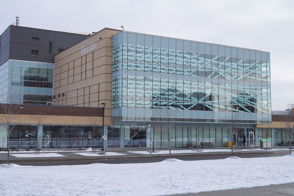
 Ride Brampton Transit’s 3/3A and you’ll likely notice something new and intriguing if you peer through the window as you near McLaughlin and Steeles. A colourful, two-storey public art installation on the western façade of the Rob Turner Building is raising eyebrows . . . and for lots of good reasons.
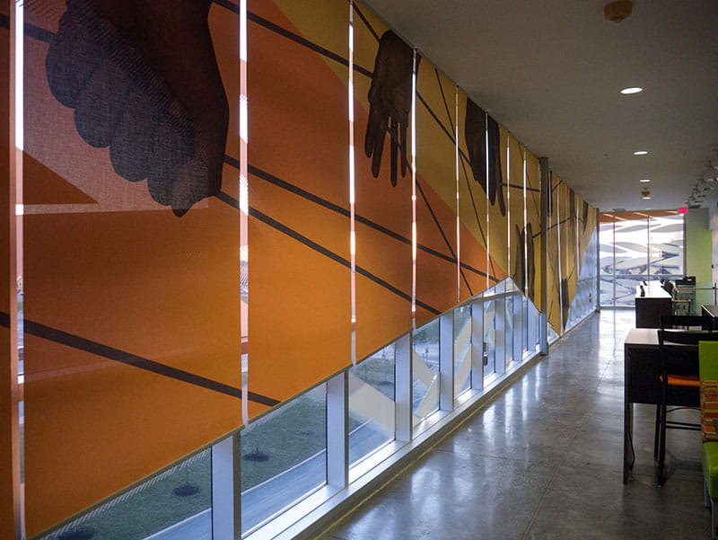
Woven Stories, as it’s formally called, consists of a series of custom designed and printed vinyl applications and blinds that wrap 112 glass panes found on the building’s exterior. Taken together, the window treatment resembles long pieces of twine when viewed from the street and depicts hands working with rope inside the space itself, conceptually representing the way that the programs that are delivered in the building work together to serve, protect and help our communities.
The project was Sheridan’s first large-scale foray into experiential design. Creating a reverse internship opportunity, Sheridan hired Lisa Rapoport and Chris Pommer of PLANT Architect to mentor students to tackle the long-standing challenge of glare and heat build-up that made the adjacent stairwell and social space unbearable.
According to Dr. Mardy Frazer, Associate Dean of the Faculty of Applied Health and Community Studies, the idea of a mural isn’t new. “The initial plans for the new wing back in 2006 called for one, though it was always envisioned as something that would be painted on the interior wall,” he explains. Frazer and his colleague Richard Finch, who was Dean of the Faculty when the project began, realized they had a problem after observing students in the space.
“Rather than sitting at the tables, students were hiding underneath them,” says Finch. “One of the meter readings we had done suggested it was bright enough to be an operating theatre on a sunny day,” adds Frazer. Thinking of Sheridan’s deliberate focus on creative spaces and energy conservation, the two worked with Dr. André Plante, Associate Vice President, Corporate Planning, Facilities and Sustainability to muster the institutional will and commitment to make a positive and lasting change.
But who could tackle such an endeavour? Ronni Rosenberg, Dean of Sheridan’s Faculty of Animation, Arts and Design had an immediate suggestion. “The project was one that required a building solution system and not just an aesthetic enhancement, which meant that we needed architects. I knew of Lisa and Chris from previous work they did for Sheridan. I was confident they’d be perfect for the job but I wanted to make sure we structured it as a way for students to learn.”
“The project provided an ideal opportunity to test our ability to teach experiential design, which concerns how you experience your environment, how spaces function and how they communicate with users”
– Donna Braggins
“The project provided an ideal opportunity to test our ability to teach experiential design, which concerns how you experience your environment, how spaces function and how they communicate with users,” explains Donna Braggins, Associate Dean, Design, Illustration and Photography. “It’s powerful when you can create a studio in which industry experts incubate young talent and students get to feel the pride of knowing that they’re creating a legacy piece that benefits the community,” adds Rosenberg.
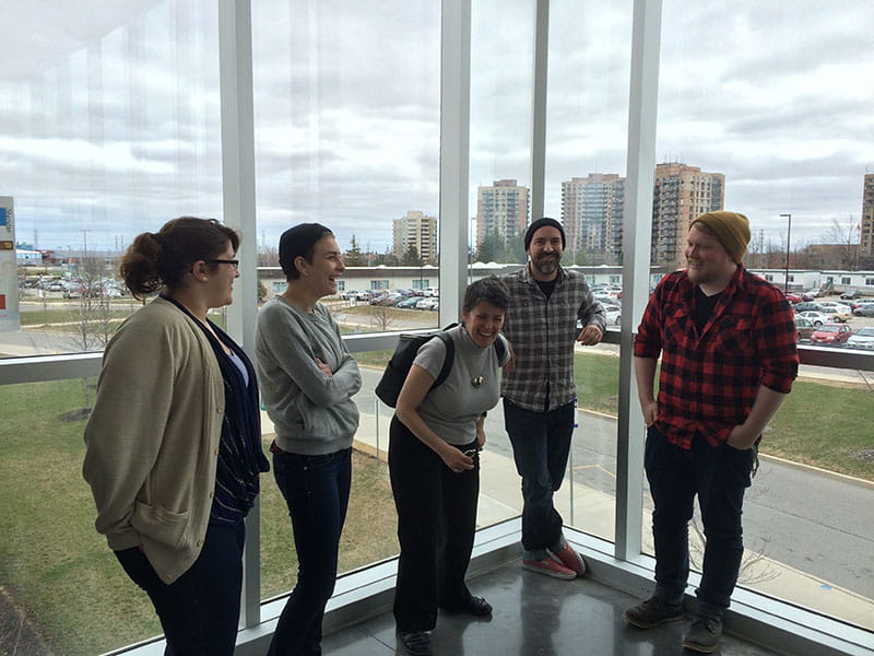
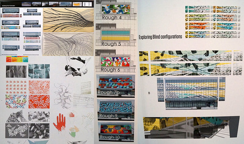
To kick off the project, Rapoport and Pommer held a three day charrette – an intense and structured brainstorming session that better defines the problem, goals and driving ideas behind a project. Held at their offices and at the site of the mural, it allowed the three professors and six students who participated to experiment, gain an appreciation for the physical scale of the space and identify a path or a structure for exploring a solution. At the end of the process, Rapoport and Pommer determined that they’d need two illustration students on the project to help with the graphic representation of the Faculty and one from industrial design who’d be helpful in manufacturing a window treatment.
“We’ve done co-ops before, but we normally work with architecture students,” notes Rapoport, which presented an interesting challenge. “Everything that illustrators do is flat. It’s 2D. For an illustrator, the only place you can see the project as a normal illustration is standing on McLaughlin. When you’re inside the space, you’re seeing it in 3D. You’re seeing the vast scale of line work. You also need to think about how you perceive the space, how you walk through, how you respond to all the scale issues. As an architect, we’re used to spatial thinking, but it was a new experience for the students.”
For that reason, the project involved Marco Cibola, a Sheridan professor of illustration. “He acted as a chaperone of sorts, answering questions that the students had that we couldn’t as architects,” said Pommer.
“Sheridan could have solved the problem in a really boring way, with some reflective surface or tinted windows. It was great that they decided to go with a mural that had a dual purpose”
– Marco Cibola
“Mostly, I ended up being a consultant on the graphics and a mediator on the architects’ requests,” says Cibola. “I gave the students some digital shortcuts to consider, made sure they were doing things efficiently and helped them look at the bigger picture and stay on deadline. Sheridan could have solved the problem in a really boring way, with some reflective surface or tinted windows. It was great that they decided to go with a mural that had a dual purpose.”
“The vinyl was challenging,” he continues. “If you make too many cuts, it gets very expensive and time consuming, because someone has to weed out the pieces you don’t need. Another way to get the desired shading is through a bitmap image which is a simple dot pattern you see in places. We etched lines to make the ropes look 3D, taking some vinyl off with a stripe pattern so it appears grey instead of white. It allows people to see through the vinyl. People want to know if their bus is coming, or if the person they’re meeting is already outside. The solution is functional and it still looks really cool.”
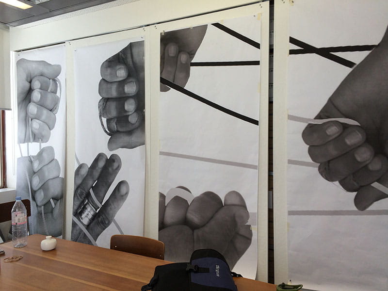
Early prototyping for the hand imagery on the vinyl blinds. Photo by Chris Pommer.
Sadie Marfisi was one of the Bachelor of Illustration students involved, who was both paid and received a co-op credit, having dedicated 420+ hours to the project. “It was incredible – we were all treated as equals. Everyone was respectful of each other’s ideas and talents.” Marfisi said that the project was a wonderful growth opportunity. “It was outside of what I do. I’m a traditional artist and I struggle with digital, where we did the work. It was also hard to think of design on such a big scale.”
Rapoport and Pommer met with Marfisi and her fellow students, Chris Sisti and Neil Smith weekly throughout the summer co-op. They spent a lot of time at PLANT and had dedicated studio space at Trafalgar Campus, managed by Professor Les Sasaki and Heather Whitton, Associate Dean of the Department of Material Arts and Design. “The project was as real as any other project in our office,” says Pommer. “Every three weeks, the students were involved in making update presentations to the Faculty – our client. Decisions were made collectively. We’d critique their work and they’d go back and tweak it. They always rose to the occasion and came back with something that was much better.”
To ensure the product would meet its functional goal, Pommer required an accurate read on the amount of heat gain in the space. This component was completed by a student in the Electromechanical Engineering Technology Co-op program Nicholas Ganesh, who was mentored by Dave Clark, a Project Manager in the Faculty of Applied Science and Technology and Herb Sinnock, Manager, Sustainable Energy Systems at Sheridan. A model was run that confirmed that on the hottest days, the space requires 55.4 kilowatts to cool it down to a reasonable temperature. With the vinyl in place, only 37 kilowatts are needed to achieve the desired effect, resulting in a peak reduction of 33%. The statistical analysis also showed the amount of heat blocked by each window pane under various design options. It helped the team decide whether they had to reverse the imagery depending on the direction of the incoming sunlight, or change the resolution of the vinyl applications.
After the students’ co-op term ended, the pair at PLANT carried on, overseeing the production elements and installation of the finished product. “It’s kind of cliché but it’s 100% true – you don’t get good projects without good clients, who are active participants. The team at Sheridan were a big factor in helping us get to something that is really interesting, exciting to look at, and meaningful to them.”
“The team at Sheridan were a big factor in helping us get to something that is really interesting, exciting to look at, and meaningful to them”
– Chris Pommer
At the end of the day, the mural helps to re-imagine and re-invent an everyday space to enhance people’s health and well-being. It captures Sheridan’s cultural character and adds a visually-rich and freely accessible artistic experience to campus and to the City of Brampton at large. By intertwining many layers of goals and outcomes, the mural proves that beauty is just the beginning.
Pictured at top of page: The Woven Stories mural at Davis Campus in its final form. Photo by Sheridan Photography alumnus Brayden Swire.
Written by: Christine Szustaczek, Vice President, External Relations at Sheridan.
Media Contact
For media inquiries, contact Sheridan’s Communications and Public Relations team.

